This year, I have a research fellowship at my university researching New and Emerging Media. I’ve thus been working on a number of different projects related to computational ways of looking at language and discourse (for example, this one). However, one of the things I’ve been tinkering with has been ways to use the social media platform Twitter to look at language, discourse, and variation.
I was inspired by a project by the University College London Centre for Advanced Spatial Analysis mapping the languages of tweets in New York City and London (and doing admittedly a much more impressive job of it than I’ve done here). After seeing their work, I wondered what a similar map of the city I live in, Atlanta, GA, would look like.
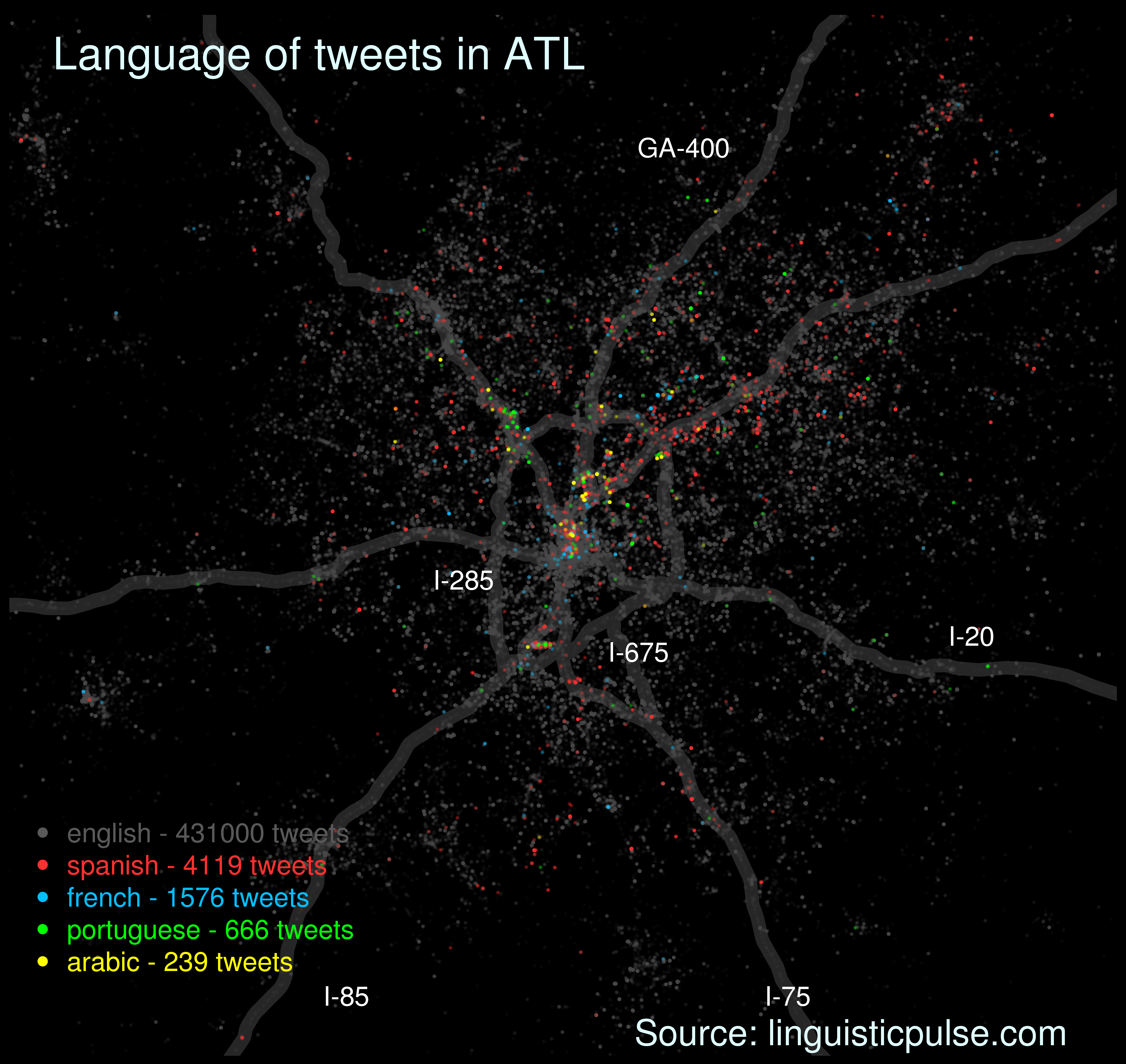
What you see above is the result. Each point represents a geo-coded tweet. In other words, a person sent out a tweet from each of the locations on this map. It’s important to keep in mind that such tweets are made using mobile devices, meaning that people may be tweeting at various locations and this map then is not just a map of where people live per se. Instead, it’s better to think of it as a map of where people move throughout the city.
To give you some sense of the space you’re looking at, I’ve plotted major roads in the metropolitan Atlanta area: Interstates 20, 75, 85, 285 (the perimeter running around the city’s central area), and 675 as well as Georgia 400, and these appear as thick grey lines on the map.
The colors of the dots vary by language. English, in grey, is by far the most prevalent and gives you a sense of where the population of Atlanta generally is distributed. I’ve also included the most frequently occurring other languages. For example, Spanish is plotted in red.
Some geographic observations
The map suggests that a few areas of the northern and central part of the city are noteworthy for their multilingualism.
First, if you look directly at the middle of the map, where I-20 crosses I-75/I-85, you will see the areas known as Downtown and Midtown. That area is basically a rainbow, reflecting the fact that these areas contain the primary tourist attractions. Other aspects that likely influence the amount of multilingual tweeting include the fact that various corporate headquarters are located here as are two major universities: Georgia State and Georgia Tech.
Second, if you follow I-85 up from where it splits off from I-75 (around Midtown), you’ll come immediately to another split where GA-400 begins. Here there’s an area known as Lindbergh. There appears to be a large number of Spanish tweets originating from this area. This area is also the beginning of the Buford Highway area, a neighborhood that is home to many of the city’s immigrant families. Interestingly, unlike immigrant neighborhoods in New York City and other cities, Buford Highway is highly multiethnic, as can be observed in the area’s signage, for example, seen below (although this map shows a predominance of Spanish tweets in the area).
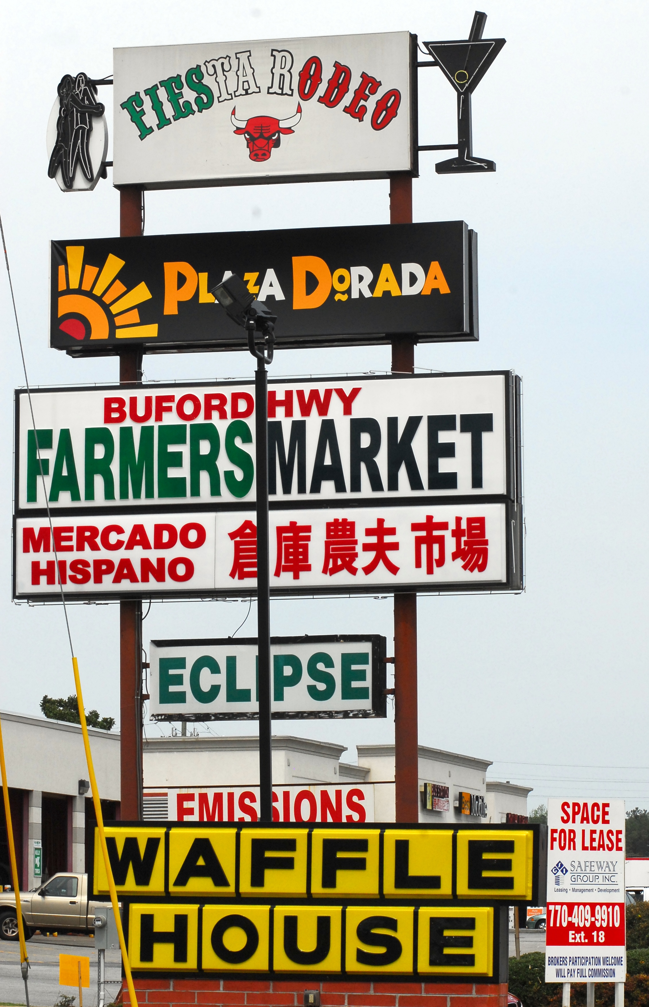
Atlanta’s Buford Highway – Atlanta, GA Photo by Kate Medley Spring 2010 (Source: Wikimedia Commons)
One final place that I notice quite a bit of multilingual tweeting is the airport, which is highly visible as a thick line of multi-colored dots just to the south of Downtown.
Of course, we have to keep in mind what exactly this map shows us and, more importantly, what it does not. I used Twitter for the power that it gives me to amass data. However, there are some notable absences. For one, I teach a literacy and citizenship course at Literacy Volunteers of Atlanta, and many of my students there are from Somalia and speak Somali (among other languages). However, many of my students are not literate in their first language. Thus their use of Somali does not appear on the map. In this and many other ways, I believe this map actually underestimates the presence of other languages in Atlanta.
Some technical details
The tweets were gathered over the course of a little over two weeks in January and February of this year. The languages of the tweets were identified using Twitter’s language identifier. However, because this language classifier can be extremely inaccurate, I took precautionary measures. First, I only used tweets that were at least 7 words long (this gives the language classifier more data to work with, making it more accurate). Second, I examined samples of each language myself to ensure that they were in fact mostly tweets in these languages (although there are of course some errors still lingering in there).
Each point represents one tweet, but I have visually emphasized non-English tweets. While all of the points are the same size, I made English tweets more transparent than the others, so that they wouldn’t obscure the non-English tweets. However, if you look at the number of English tweets, you’ll see that for every Spanish tweet there are over 1000 English tweets and this ratio is even higher for the other languages. Thus, the map highlights the presence and location of other languages. To get a sense of the actual ratio of English to other languages you should use the numbers in the legend.
Finally, if you’re interested in doing things like this yourself, I created the map using the statistical computer language R along with a few add-on packages: maps (for creating maps in R), mapdata (contains maps of the world), streamR (for collecting data from Twitter), osmar (for collecting open source data about roads), and scales (for color manipulation).

It would be interesting to be able to break the English down into dialects, as well! Cool graphic as is, though–isn’t it so fun to experiment with new tools? 🙂
This was quite fun, and there’s something quite aesthetically pleasing about the data presentations that quantitative methods produce.
Anyway, you’re right about the dialect suggestion as well. I think trying to find dialects on Twitter comes with a lot of issues (especially since a lot of the regional speech features occur at a phonetic/phonological level). However, I have been tinkering with the possibility of mapping things like lexical choices (e.g. soda vs. pop vs. coke), orthographic chocies (e.g., goin vs going), and syntactic structures (e.g., the car needs washed vs. the car needs to be washed). So far though, I haven’t succeeded.
Fascinating study! Makes me wonder how such a map would look where I live (metropolitan Washington DC area). Also, how to account for other languages is a valid point. It is incredible all that technology makes possible today.